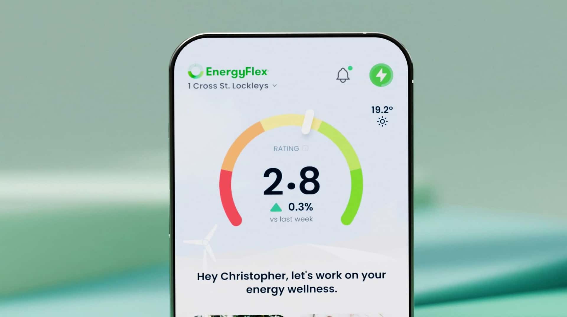

The EnergyFlex app has won a 2026 Australian Good Design Award in the Digital, Apps and Software category. It is credited to EnergyFlex and CodeFish Studio. Congratulations to the EnergyFlex team.
EnergyFlex is a free platform that helps households, renters and businesses understand their electricity. It reads smart meter data through the Consumer Data Right and turns it into a few clear answers: what your plan is costing you, when power is cheapest and cleanest, and what to change.
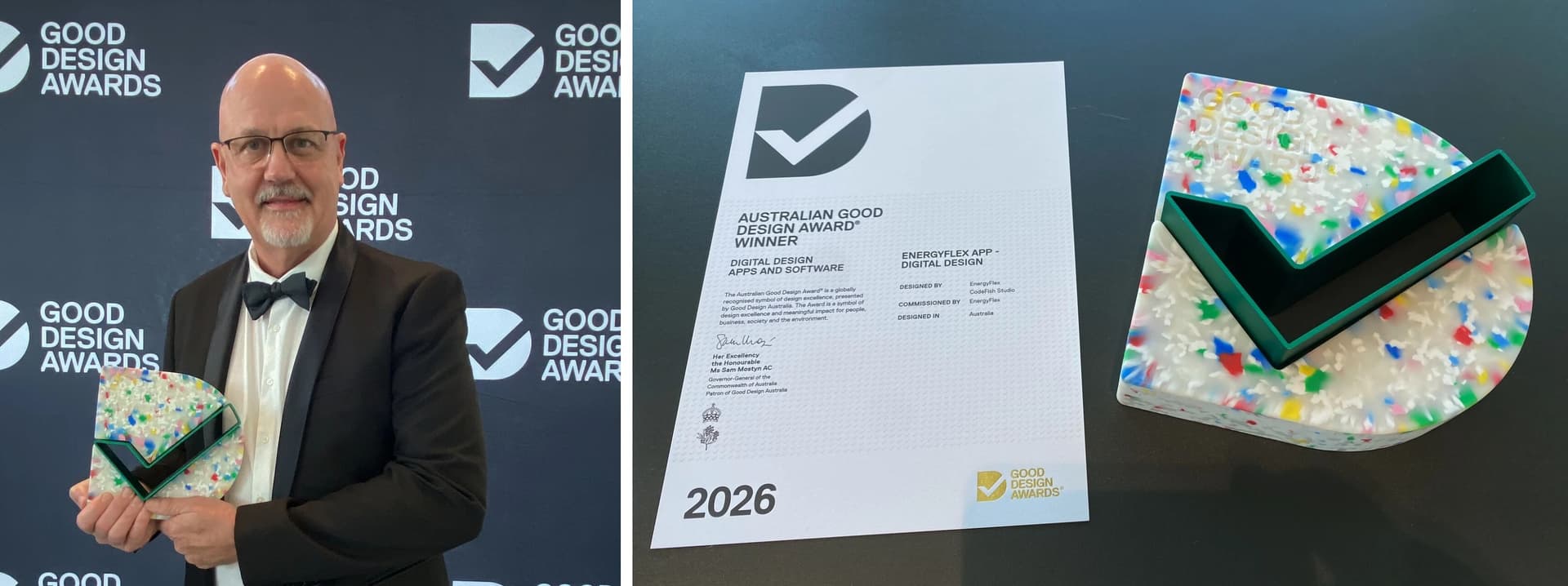
Garry Harding, CEO and Founder of EnergyFlex, with the 2026 Australian Good Design Award for the EnergyFlex app.
The problem we were brought in for
The data was rich and the intent was right. People were not getting to the value.
Users opened the app, could not see what to do next, and left. The Consumer Data Right meant they had to go through consent and data-sharing steps before seeing anything useful, which is friction at exactly the moment people care least. And the audience had shifted: a product built for corporate customers now had to work for individuals too.
All of this had to happen against investor milestones, so the design work ran on a clock.
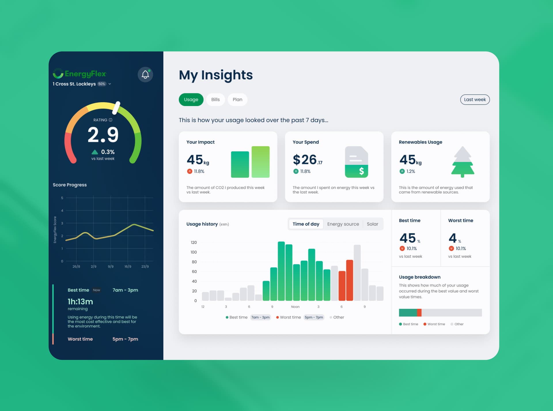
What we changed
The consent steps could not be removed, so we changed what they asked. Onboarding now leads with what you get back for sharing your data. A compliance gate became the first useful thing the product does.
We worked on the roadmap as well as the screens. Features were prioritised so each sprint went at the work with the most impact, which let EnergyFlex hit its milestones without extra spend. We moved to sprint cycles to match their timelines, and put a structured UI system underneath so the product could keep growing without design debt piling up.
Why it won, in our view
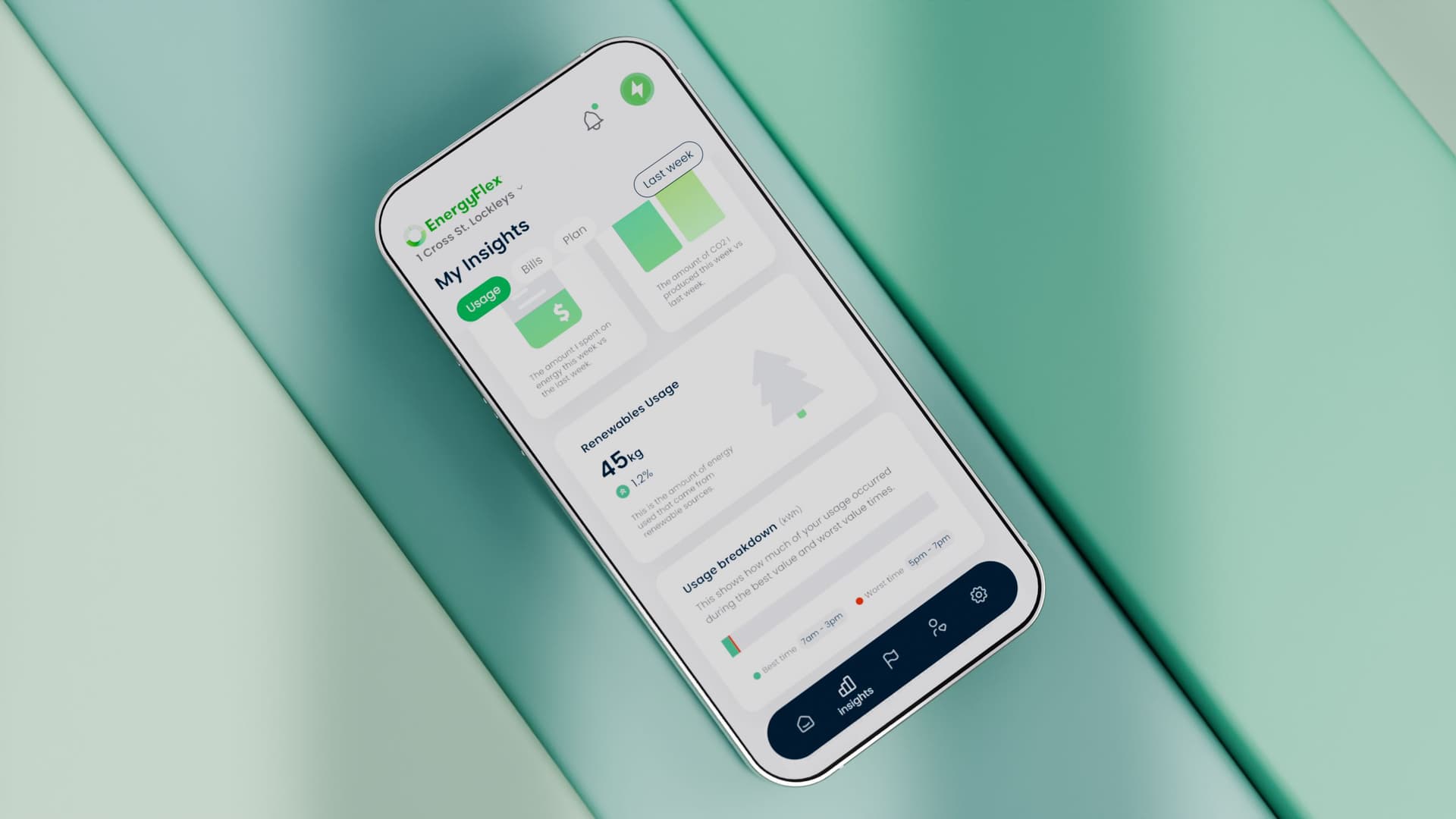
Energy is confusing. Tariffs, demand windows, solar exports and emissions are hard to explain to an expert, let alone someone checking their bill on the couch. The award recognises a product that makes that simple without hiding the detail from people who want it.
That is what good UX does. It does not make the data less complex. It makes the next step obvious.
Read the full story in the EnergyFlex case study. If your product has the depth but people are not getting to it, talk to us.